Form and Function
In one of my previous posts, I highlighted Dr. Patricia Tarr’s challenging questions about room layout and wall displays. After taking some time to digest her comments, I wanted to post a few of my thoughts regarding the implementation of her comments in my art space. I am going to throw in room layout too since I found that it is more helpful to discuss them both in tandem as they often work hand-in-glove. (Of course, I still wrestle with some of my decisions so I can’t promise I won’t amend the post latter should inspiration strike!)
“This Year In Art”

Click to Enlarge
I decided to use large stripes of different colored paper to differentiate between my four classes. I keep this consistent as best I can when needing to post “I Can” statements (see below) for learning goals. This wall contains the heading, “This Year in Art” as the art movements I have chosen to focus upon will be highlighted there. This wall display includes art-related vocabulary we are using for the work we are doing as well as key artworks from relevant artists. It is simple and straightforward. I refer back to it so students become habituated to looking there for using words in our classroom discussions. It will be added to now that I am moving on to the next movement for each grade. The wall to the left has some larger images of key works. This is still a work in progress as I wrestle with moving the display towards more engagement and not merely decorative. (I will post specifically on this wall display after I update it with my changes.)
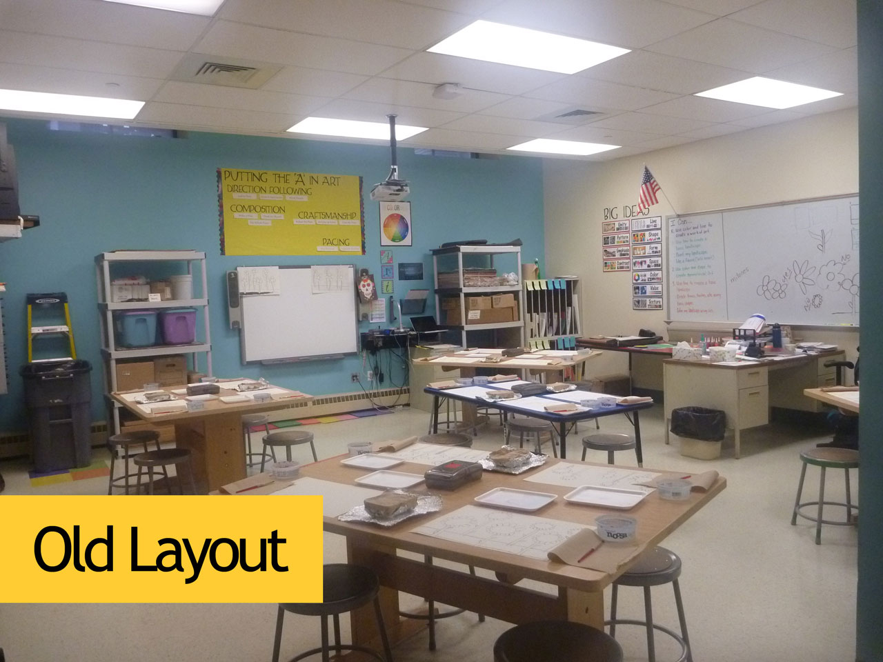
Of Necessity: Sinks and Supply Tables
With the hook-up of my sinks (one full-size, another kindergarten-sized) came another adjustment: moving my supply tables. I originally had them both separated because there was one I didn’t want the kids to touch and another I needed them to use regularly. I had asked facilities to get me one of the old red tables that used to be used for classrooms so I could link the whole “Red means stop/warning/danger” idea with this table since it was to be only used by me. Nice idea—if I had more space.
With the reorganization of the furniture along the wall where my whiteboard is located, I was able to put my supply tables together to form an “L” by my sinks (see photo above). So far, this has worked out pretty well. I could use additional space (of course) so I could:
- Have a place to put work to be done for the day and then graded at the end of the day
Presently, I put the work to be done on my cutting board which is fine until I need to use it and then I need to move everything. Horrible? No, but inconvenient when I need to use it quickly during a class. I may start putting the work to be done/then graded on top of my vertical storage even though it is taller than I am which makes sifting through it quickly awkward. - Put supplies out specific to the grade level needing them
This happens now but the “L” shaped area gets congested quickly which can make it difficult for students (whose thinking doesn’t always match the speed at which they want/demand things). - House things like my cutting board and other teacher-only supplies
I have my cutting board at the end of the table where my other supplies are located. So far, this hasn’t been a problem though occasionally I have to remind a student that it is dangerous.
Whiteboard Wall to the Rescue
I recently repositioned the area by my whiteboard because my desk was originally set up perpendicular to it which limited my ability to use the whole thing during classroom demonstrations and discussion. It also forced the table layout to be a certain way because my desk stuck out more. Now, my desk is at one end by the area where I store current student work.
Click to Enlarge

Click to Enlarge
I was excited to open up my 12′ whiteboard to more specific use as I nearly always need it for each of my classes since they all are doing something different. Before, because I was limited to the space I could use due to my desk location, I had class information jumbled together. Now, I can segment (and color code!) the content in vertical bars similar to what I have for my “This Year in Art” display.

BEFORE: Yikes! What was I thinking?!

AFTER: Two of my four classes. Ah, sanity!
“Big Ideas”
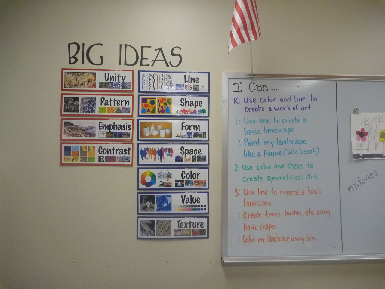
Click to Enlarge
I include specific Elements of Art and Principles of Design only because I do not cover them all in my curriculum. I have them posted as a reminder and alert students to when we are working on specific Elements and/or Principles. When I do my PowerPoint presentations, I highlight them specifically and in context. All of the Elements of Art are included in my wall display. They are more straightforward to see in art and use than the Principles of Design which require more thought in their application because they involve the application of more than one Element.
“Putting the ‘A’ in Art”
Student self-assessment is something I wanted to address this year, but I struggled with how to implement it. So, I created a large display over my SMARTBoard that lists the five areas that I consider when I review student work (and what I want them to think about too!). Under each of those headings is a few keywords that lets students know what they should be doing to earn top-marks in that category. The kids ‘grade’ themselves on a 10-point scale at the end of each class with me.
I am simply mentioning this here now. I am not going to comment on it further since this is something new I am implementing for my 3rd and 4th quarters at school. As such, I will post on this fully once I gather some data. For now, you can see how I have it set up.


I really enjoyed your perspective on wall decorations! It’s so true that decor can shape a space and reflect personal style. As someone involved in tree removal, I’ve also noticed how elements of nature, like wood, can inspire wall decor through texture and material.
Have you ever explored incorporating reclaimed wood or other natural materials into wall art? It would be interesting to hear how you think these natural elements could enhance certain styles.
https://www.mesatreeremovalservice.com/
LikeLike