
I presently overlap my curriculums so that my students are introduced to an art movement and then experience it again during another year of study. Like my Kindergarteners, my Second Graders are studying Abstract Expressionism. This particular project I did with them was actually two parts combined into one.
A mix of contrasting applications, I had students learn about symmetry by making 2D masks and then switched them over to the widely loose and personal application of color and paint with Abstract Expressionism. This post will detail a bit of the road we took to get there.
Abstract Expressionism
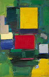
Influential teacher and Abstract Expressionist artist, Hans Hofmann’s, The Gate, 1959-60
Developed in the 1940’s in New York, Abstract Expressionism was the first uniquely American art movement to achieve World-wide notoriety. This post-World War II movement, focused heavily on spontaneity and in-the-moment creation. Although their appearance belies thoughtful art making, in reality Abstract Expressionist works were still controlled expressions and artist-driven. Paintings created during this time broke conventions in how they were made as well as in their subject. These artworks left behind a concern for recording the visible world and rather focused on the process of painting, the experience of the artist during the act of painting. It is not a monolithic art movement. Like a good novel, it has its fair share of characters and subplots. You can read more here and here.
The Mask

Click to Enlarge
The masks we did were two dimensional, not 3D. I took a rather laborious route to get to the final project that I will not be using again. In trying to reinvent the wheel, I designed a quick handout that I had the kids fold in half. The fold allowed them to create two different designs. In the end, they were given the choice of which set of eyes, which nose, and which mouth they would like to use on their final.
Once they selected those facial features, I demonstrated to them how to transfer their designs onto their final paper by:
- Tracing their pencil lines in Sharpie
- Rubbing on the back of the design where they traced (because they could see their Sharpie lines through the paper), and
- Lastly, tracing over the marker lines with their final paper taped underneath
Voila, the image transferred.
Ah, the best laid plans of mice and art teachers. Sadly, the kids didn’t quite get they were creating one half of a symmetrical design by tracing. They wanted to do both designs they created! Who knew?! In principle, the idea seemed like it would really help them and provide them two choices. In practice, it flopped horribly and ended up stretching out the project. But, you live and learn, right?
Fast forward to having a final pencil drawing that was complete and demonstrating symmetry. Oh, just so you know, I defined symmetry for my Second Graders as “what you do on one side, you do on the other.” When I reviewed the definition with them, I incorporated a simple hand movement to reinforce the verbal prompt. The final pencil lines were outline in fine tip Sharpie, and then colored in. Here too, the students were reminded to use symmetry to make the sides of the mask match one another in color.
Once done with coloring of the facial features, we talked about composition and then added design elements to fill out the space where there was sufficient white space to warrant it. The process remained the same: draw in pencil, then outline in Sharpie, and lastly color with markers.
Because I wanted the masks to stand out against the Abstract Expressionist background, I had the students use a tracer that I created that would put a black border around their mask. This part of the project gave the kids an opportunity to practice some fine motor skills as they traced the border, cut it out, and then glue their mask onto the black paper.
One mask down; a background to go!
Abstract Expressionist Background … No. 1
My original plan was to have the students create large, 12″ x 18″, backgrounds. Therefore, I allowed the kids to select the color construction paper they wanted to use. I set up my tables so each one had a different color on it. At the beginning of this lesson, I review the major players of the Abstract Expressionist art movement and we talked about the choices of each artist and how those choices affected their work:
- Arshile Gorky :: Primarily organic shapes (‘automatic’ painting)
- Jackson Pollock :: Splatter painting (splatter painting)
- Hans Hofmann :: Primarily geometric shapes (push-pull painting)
The students then set about to create their own Abstract Expressionist artwork. During our initial discussion, I gave some guidelines for them to follow:
- Use shapes, splatter technique, or a combination of both
- Be deliberate with their organic or geometric shapes; no squares that kinda-sorta look like blobs
- Shapes have to overlap as well as stand alone
- Shapes must show a variety in size
- Use the background color of their paper as part of their color scheme
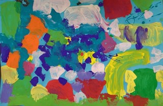
With a plan in their head, they set out to work. Because I wanted them to layer their work, I gave them three class periods to finish. Well, the plan worked out real well. The kids had a blast during the process. They turned out very different from my Kindergarten work which I expected, but is always nice to see for developmental reasons.
Abstract Expressionist Background … No. 2

Click to Enlarge
Well, truth be told, I thought the Second Grader 12″ x 18″ Abstract Expressionist pieces were so successful, that I had the students create a smaller version because I didn’t want the masks to be glued onto them! Oh, you kooky art teacher, right?! The kids gave me no arguments because they loved the freedom of painting in this way. (Well, at least, most of them enjoyed it!)
So, out comes the 9″ x 12″ colored construction paper. We talked about how we were going to solve the problem of having one class period to create this artwork. As we discussed strategy and process, the students realized they needed to:
- Create shapes first so they wouldn’t smear their colors
- Limit the number of shapes because of the size of the paper
- Add splatters as final touches on top of their shapes (if they wanted)
- Avoid doing a splatter-only painting because there was no time for layering
- Use similar colors used when they created their masks (consistent color scheme)
The results were good here as well. Once they dried, the students chose whether to have their mask sit vertically or horizontally, centered or off-to-one-side. We used a glue gun to mount the masks onto the backgrounds.
It was a long road, with lots of twists and turns, but we got there! The kids had fun and learned a lot. You can see more of my student’s work by going to Artsonia.com. I’ve changed the way the classes are listed. Instead of having all 120 pieces of art under one listing, I now have them broken out by class to make them more accessible:
| Class 2A | Class 2B | Class 2C |
| Class 2D | Class 2E | Class 2F |
New to The Poetry of Seeing?
Stay in touch! Click “Follow My Blog” at the top left to receive an email when new articles are posted. You can stay current with a “Like” on my Facebook page: Facebook.com/ThePoetryOfSeeing.


Pingback: Cool Shot Super Low Temperature Glue Gun Review | The Poetry of Seeing·